LG’s smart TV platform, webOS, has been a mainstay feature on its TVs and continues to evolve every year. It’s easily one of the best smart TV platforms out there, but hasn’t been without its share of criticisms in the past.
Last year’s version, webOS 23, featured on some of the best TVs on the market, including the LG C3, LG G3 and LG B3. We frequently praised it for its level of customization, its ease of navigation thanks to its new Quick Cards and quick menu, and its overall layout. Overall, it was a big improvement over webOS 22.
I’ve recently been testing one of LG’s latest mini-LED TVs for 2024, the LG QNED91T, and this comes installed with the latest version of webOS, webOS 24 – which will also be available on the LG C4 and LG G4 along with the rest of the range. While on the surface it may not seem like much has changed, there are some new features and upgrades that have been introduced and improved on that makes this arguably the best smart TV platform I’ve used in several years of both reviewing TVs and working in TV retail. Here are the three features that really jumped out to me.
1. A neater, toned down layout
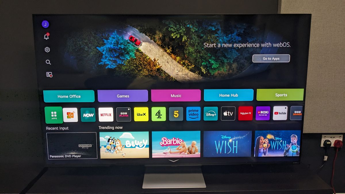
Although a simple change, webOS 24’s home screen layout and appearance is easily one of its best features. Last year, webOS 23 improved greatly on webOS 22’s cluttered ad and recommendation-heavy home screen in a big way, and webOS 24 has taken this a step further.
Quick Cards, an addition to webOS 23 last year, collects any apps relevant into its category such as Game, Sport (more on that below), Music and more. So, for example, the Game quick card collects all the cloud based gaming services that webOS is compatible with such as Nvidia GeForce Now, Luna, Utomix and so on. In webOS 24, these cards have taken an even more slimmed down appearance on the home page and have become even more intuitive.
As you scroll down the home page, rather than being confronted with tons of ads and recommendations, you’re now met with a leaner set of menus. LG has opted for a more simple approach, such as the Now Streaming section in the picture above, which rather than spreading out every individual streaming service to its own line has collated them with a side-scrolling option to the relevant service you want.
If you use broadcast TV, there’s also a live TV guide that shows what’s live now, a Life’s Good Hub with LG recommendations and more. But if you don’t want these on your home menu, you can simply remove them, leaving you with a compact home menu that simply shows your favorite apps.
2. Sports quick card and My Team
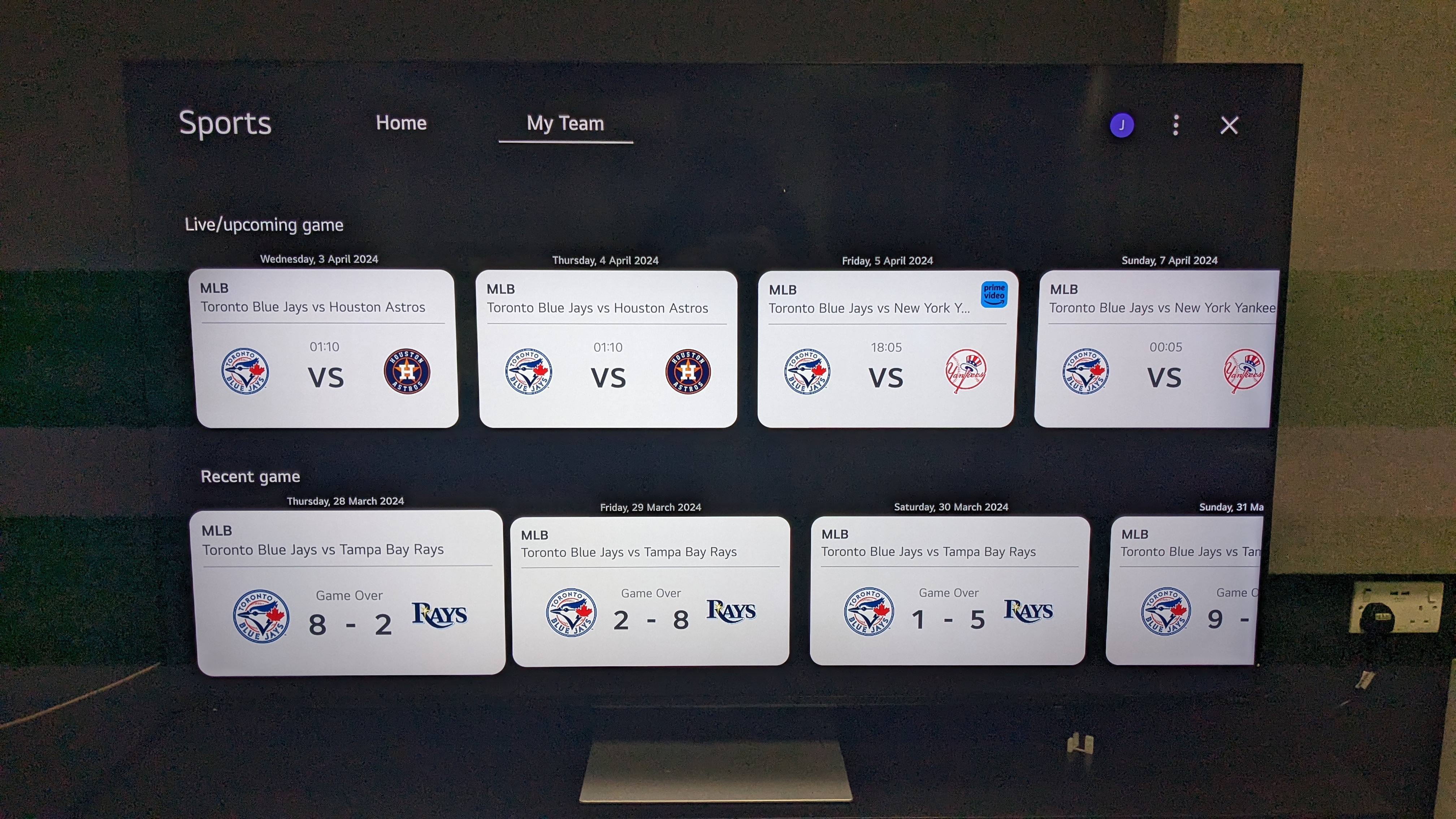
For a sports fan like myself, the sport quick card has undergone some changes and includes a feature called My Team. In this, you can select your favorite team from a fairly extensive list and it’ll keep track of live score, a team’s schedule, recent results and even relevant videos.
Admittedly, as a rugby fan, there weren’t many options, but there were plenty of other options to choose from and LG covered its bases well with soccer teams from major leagues including the Premier League, Serie A, La Liga, and more. There was also extensive coverage of the MLB, NBA, NFL and NHL as well.
As a fairly new (and still somewhat casual) baseball fan, keeping track of the 162 regular season games can be daunting. So, I tested webOS 24 by choosing my favorite baseball team, the Toronto Blue Jays, in My Team. Immediately, I was shown all the Blue Jays’ recent scores and games and their upcoming schedule. I was even shown that I could stream one of the upcoming games on Prime Video, in its Discovery Plus add-on – something I didn’t know.
The main home page of the sports quick card takes on a broader approach and still includes popular video such as Premier League highlights and headline scores for those interested in multiple sports and combined with the My Team feature, this was one of my favorite webOS 24 features.
3. Improved accessibility features
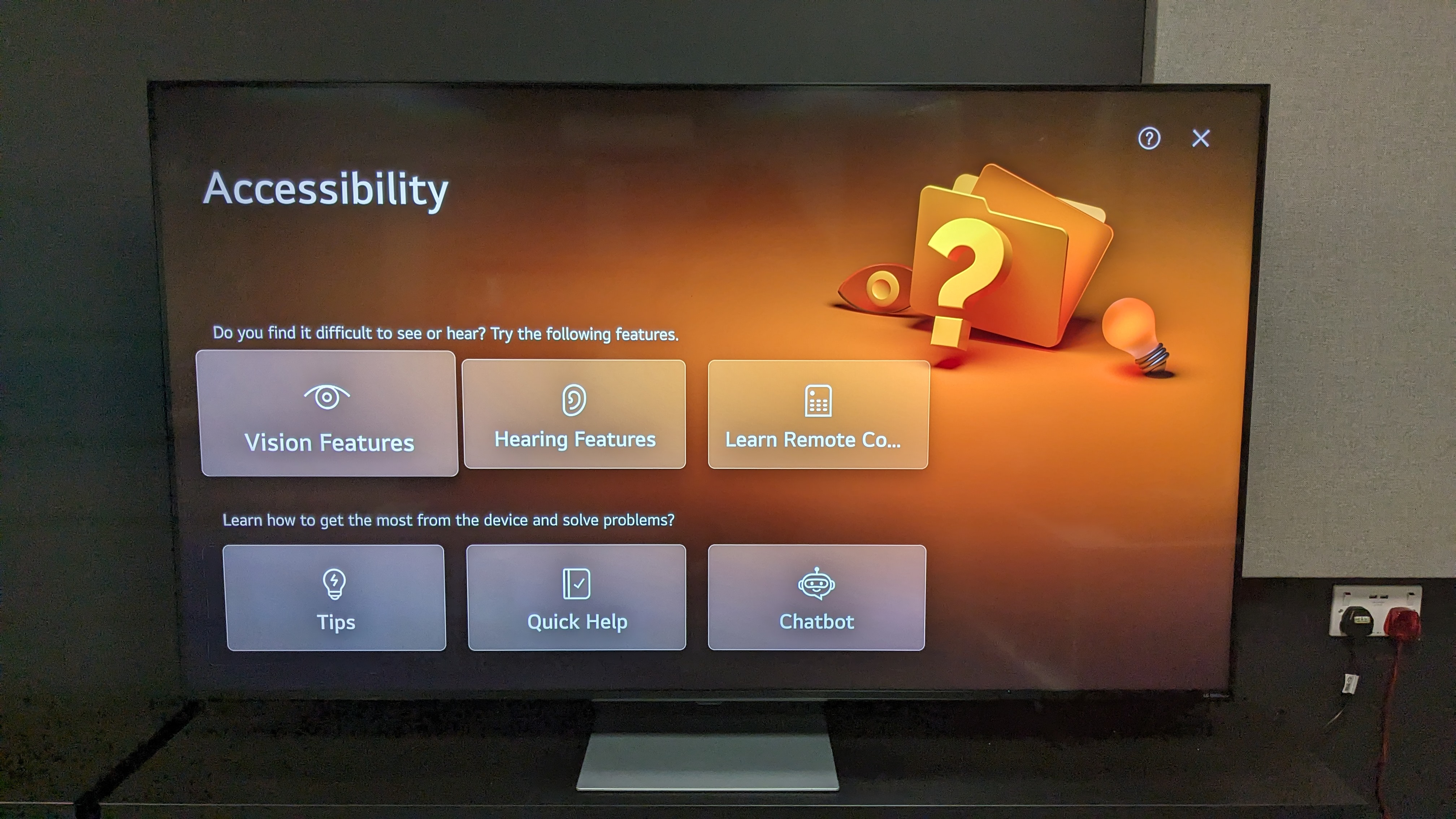
More TV brands are starting to go to great lengths to make TV accessible for everyone, via voice assist, audio description, subtitles and so on. In webOS 24, LG has introduced an accessibility Quick Card, meaning it’s easy for those who need these features to access them, because it sits front and center on the home page. In the past, these accessibility features were often, and still are in some cases, buried in settings screens.
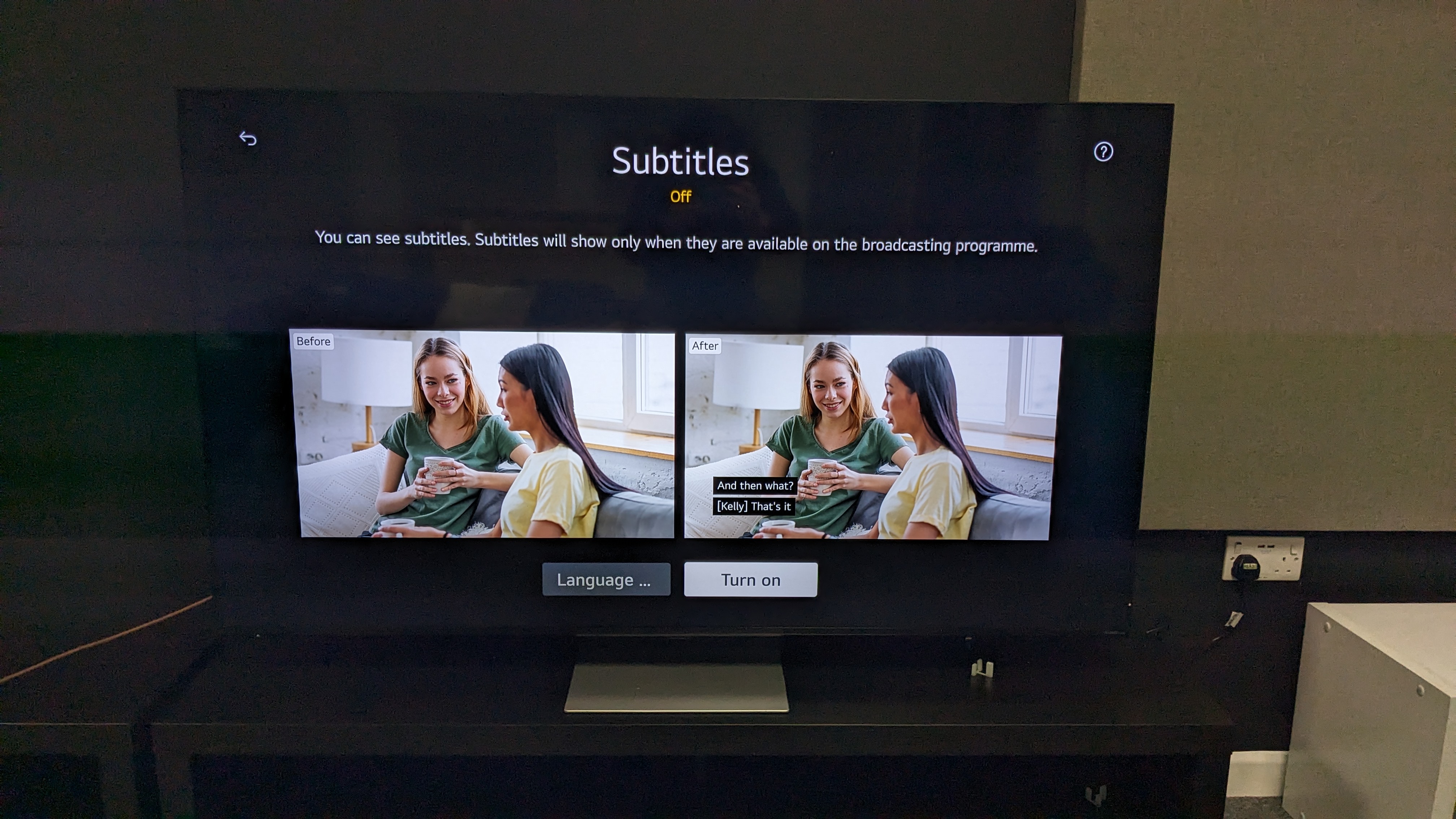
On this accessibility Quick Card, these accessibility features are not only easy to access, but do a great job of demonstrating just what the user is getting. Something as simple as a visual demonstration of what subtitles turned on will look like on screen (as shown in the photo below) is a further step to make things easier for the user.
Finally, there’s the introduction of the AI chatbot. This tool is designed to assist in issues users may be experiencing with the TV such as the screen being too dark, sound being too quiet and so on, and assist where possible. It can be used via voice command or on-screen with inputs from the remote. It’s certainly a useful feature that, while it may not be the most extensive, will certainly aid some users having basic issues and not knowing where to start with fixing them, and will no doubt be improved in further updates.
