The stock market has a long-term bullish bias and the monthly return metrics are reflecting this positive bias. Chartists looking for a seasonal advantage can compare benchmark metrics to monthly performance numbers. Months that outperform the benchmarks have a positive bias, while months that severely underperform have a negative bias. Four months stick out at the top and four months stick out at the bottom.
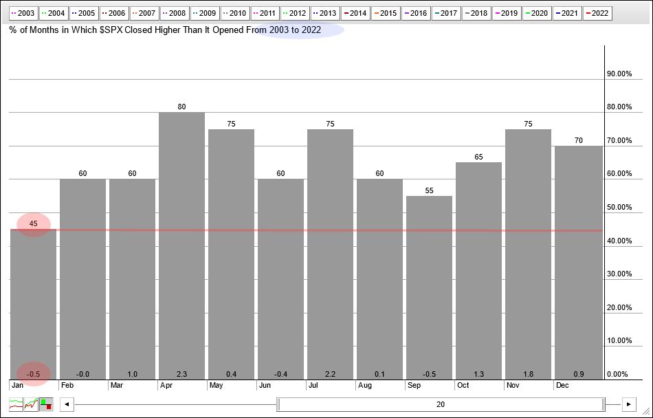
Seasonally, January is one of the weakest months of the year. The chart below shows the monthly performance for each month over the last twenty years (2003 to 2022). The numbers at the top of the histogram bars show the percentage of months the S&P 500 closed higher. The numbers below show the average wins/losses for the month.
Eleven of the twelve months closed higher in 55% of cases or more. January is the only month to close lower less than 50% of the time (45%). The average profit/loss for January is -0.50%, which is also the lowest of the 12 months. January was easily the toughest month for the S&P 500 in the last twenty years.
I would like to extend the review to 2000 as that year marked a peak and subsequent bear market of 2001-2002. Since January 2000, 276 months have been traded. The S&P 500 closed 62% higher these months and the average gain/loss was 0.45%. These performance metrics show a long-term positive trend.
Now let’s look at January again. The next image shows the monthly performance for January since 2000. The monthly gains and losses are on the left with the average gain/loss at the bottom and the percentage of months closing higher. January closed higher only 43.5% of the time with an average loss of 0.54%. January underperformed benchmark numbers, suggesting a bearish bias for the month.

The chart to the right shows a hypothetical equity curve for January. Equity starts at 100,000 and increases or decreases with monthly changes. January was exceptionally rough from 2000 to 2010 as the equity curve declined (red arrow). From 2011 to 2022, performance was mixed as the stock curve bounced up and down (blue line). Overall, there is no definitive trend for the stock chart, meaning the month could go either way.
This report goes on for Subscribers at TrendInvestorPro.com. We look at the equity curves for the next five months and show a performance chart for all twelve months. 2023 marked a step towards an even more systematic approach at TrendInvestorPro when we launched a fully quantified mean reversion trading strategy for ETFs. Click here for instant access.
The Trend Composite, Momentum Composite, ATR Trailing Stop and eight other indicators are part of the TrendInvestorPro Indicator Edge Plugin for StockCharts ACP. Click here to learn more and take your analytics process to the next level.
—————————————————–

Arthur Hill, CMT, is Chief Technical Strategist at TrendInvestorPro.com. Focused primarily on US stocks and ETFs, his systematic approach to spotting trends, finding signals within trends and setting key price levels has made him a valued market technician. Arthur has written articles for numerous financial publications including bars and Magazine for stocks and commodities. In addition to his Chartered Market Technician (CMT) designation, he holds an MBA from Cass Business School, City University, London.


