VW appears to have pulled a U-turn on its decision to gradually rid its modern vehicles of physical buttons. The company’s interior designer, Darius Watola, told Autocar that its recent ID.2all Concept “showed a new approach for all models” and was in direct response to “recent feedback from customers” surrounding irksome touchscreen functionality.
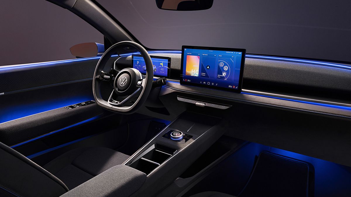
In stark contrast to much of the German marque’s recent ID all-electric range, as well as the latest generation of Golf, the recent unveiling of a physical ID.2all concept car (above) shows a row of physical, backlit buttons beneath the main touchscreen infotainment display, as well as a rotary dial in the central tunnel that allows for physical interaction with menus on said display.
This physical model goes beyond early concept imagery, by adding even more switches.
The move has been made to address some of the recent criticism leveled at the brand. In a separate interview with Autocar, VW CEO Thomas Schäfer told the outlet that the reliance on touchscreens “did a lot of damage” to the brand, with numerous customers and journalists alike bemoaning the decision to commit everything to displays or awkward touch surfaces and capacitive buttons.
The concept vehicle, which a select few journalists were allowed an early poke around, will go on to inform a new production model that will sit underneath the current ID.3. It is due for release some time in 2026 and VW claims the goal is to offer it at less than €25,000 (around $28,000 / £22,000 / AUS$41,500) when it goes on sale, while offering 280 miles of electric range from a larger 56kWh battery pack. A more affordable 38kWh option is also rumored to be available.
Despite the budget price point, VW design boss Andreas Mindt claims that the company’s future vision is to ensure upcoming models will have a “stable and likable design, always with a secret sauce”. He also admitted that “customers say a pure touchscreen is not enough and they expect physical switches and dials for important functions”.
The concept previews a row of buttons that take care of things like the air conditioning, rear window de-mister and hazard lights, all key functionality that the driver needs to access quickly and without distraction.
Granted, it appears as though VW definitely isn’t committing everything to physical buttons just yet, but it feels like a step in the right direction to meet the pure touchscreen haters in the middle.
Analysis: Interior UX lets the ID range down

So much of a driver’s impression is formed from interactions with the infotainment system when piloting a modern car, and the user experience in Volkswagen’s ID range is arguably one of its biggest downfalls.
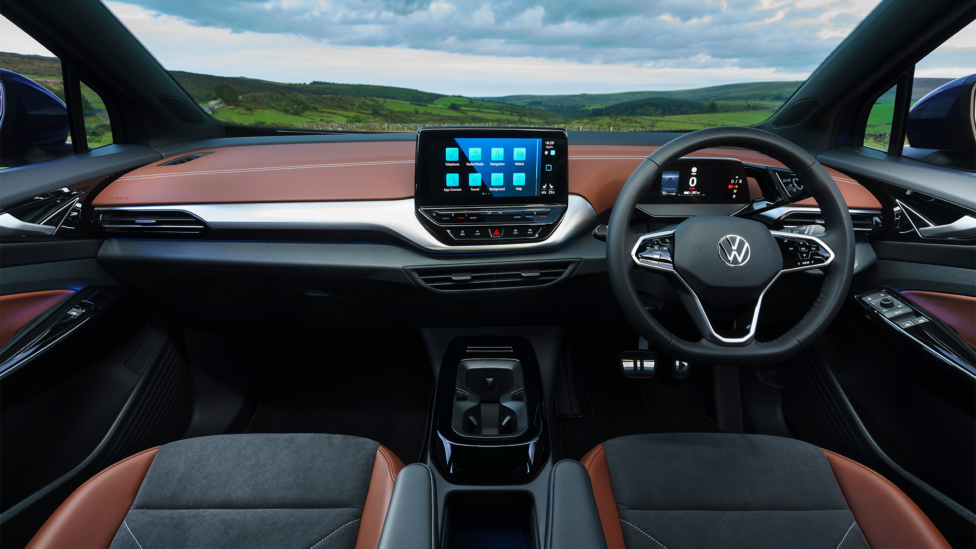
Take the ID.4 as an example. It is a fantastic EV – smooth to drive, quiet, spacious and offers a solid electric range for the money – but VW’s decision to commit everything to screens and capacitive buttons means the daily experience is far more difficult than it needs to be.
The electrified family crossover is bereft of any physical buttons, including for important things like the handbrake. This comes on automatically when you stop, but there’s a menu screen to turn it off, which seems completely illogical.
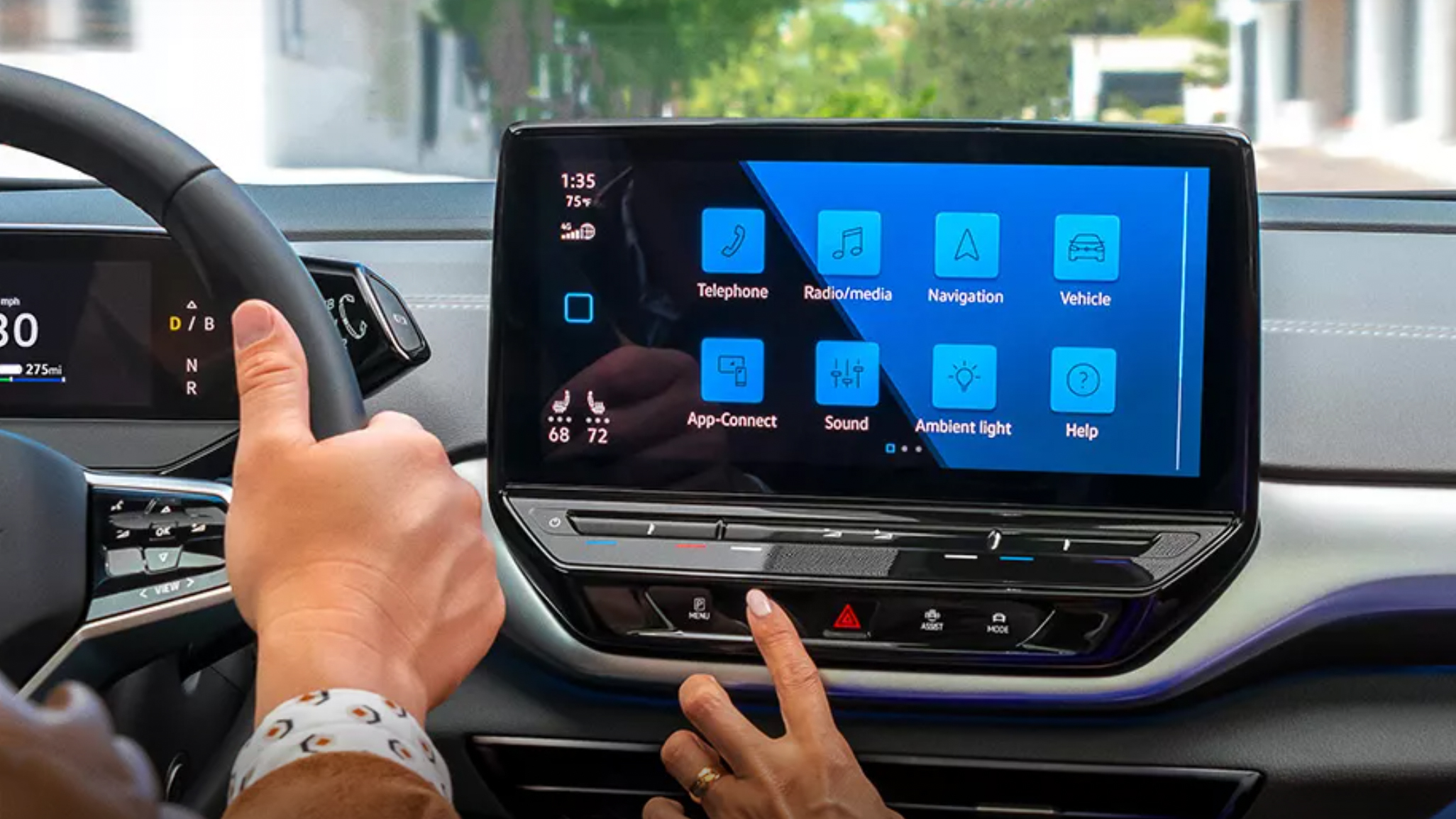
Temperature controls and volume sliders consist of two touch surfaces beneath the main infotainment screen, which are easily nudged when interacting with the navigation or some other menu. None of these are backlit, making them almost impossible to locate in low-light situations.

Below these is another set of flush capacitive surfaces that bring up the parking menu, climate control and driving modes. All they do is act as shortcuts to sub-menus on the display, requiring more interactions than are strictly necessary.
Finally, and to round off a button-based rant, the haptic buttons on the steering wheel are far too easily activated when the driver is busy, erm, steering. Plus, see how long it takes someone to figure out the wing mirror adjustment. It’s almost like a hidden easter egg when it really needs to be a big obvious button.
The relentless drive to rid modern vehicle interiors of physical buttons and dials is not just a VW problem, as Tesla owners have had put up with this kind of thing for years. But although it might feel modern, even futuristic, it’s often far from practical and not what real-world buyers want.
Plus, one of the biggest criticisms I leveled at the ID.4’s interior after running a press car for a few weeks was that it felt too sparse, particularly in the more basic models with gray fabrics and matching gray plastics. A few buttons and dials sprinkled here and there would have actually livened up the place.


