KEY
TAKEAWAYS
- Sector Rotation remains defensive
- S&P chart showing resemblence to late 2021
- Negative divergences still in play
First of all, I apologize for my absence this week. I caught something that looked like Covid, and felt like Covid, but it did not identify (pun intended) as Covid. Apart from feeling lousy, also my voice was gone, so making a video was not a good idea.
I am getting back into the trenches now (not 100% yet), at least with this short article, after an eventful week marked by a historic interest rate decision.
What’s happening in sector rotation?
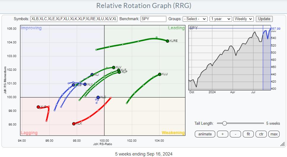
The weekly Relative Rotation Graph for US sectors above largely shows a continuation of the rotations set in motion a few weeks ago.
There has been a small increase in the energy and Communication Services sectors. Energy is far to the left inside the lagging quadrant and, based on RS-Ratio, the weakest sector at the moment. Communication Services is very close to the benchmark and on a very short tail, which has also been pretty erratic over the last few weeks.
The Real Estate sector inside the leading quadrant lost some steam (upside momentum), but based on RS-Ratio, it is still the strongest sector.
All other sectors remain on the same trajectory, with XLU, XLP, XLF, and XLV leading the dance into the leading quadrant. When slicing the sector universe into offensive, defensive, and sensitive, this means that all defensive sectors are inside the leading quadrant and traveling at a strong RRG heading.
Then, there are two offensive sectors also inside the leading quadrant: Financials and Real Estate, which are also very interest rate-driven sectors.
All sensitive sectors (XLI, XLE, XLK, XLC) are on the left hand side of the graph with only XLI showing a positive RRG heading.
Dilemma
But here’s my dilemma: The market’s response has been pretty bullish so far, with SPY breaking through overhead resistance this week. It pretty much ignores the defensive sector rotation but also the strong negative divergences between price and RSI/MACD.
So, do I go with the flow in the upward break and call off any risk for corrective action? Or do I stand by the analysis from a defensive sector rotation and pretty strong divergence signals from classical technical indicators for a little longer and try to see through the current bullishness?

Here’s the S&P chart, which shows the run-up to the late 2021 peak and the current market behavior.
The two charts above show the market behavior of 2021 up to the week of the upward break aligned with the current market.

These two RRGs show the rotation for defensive sectors around the peak in 2021-22 and the current.
Price Pays, but Don’t Bet The Farm
I am the first to admit that price pays, and you cannot buy the RSI or the MACD. Still, history makes me think that long-lasting negative divergences between price and these indicators, as we see them now, have proven to be pretty reliable—reliable enough for me not to go all-in and bet the farm on the upside.
Combine that with the current defensive sector rotation and the strong resemblance to the setup shortly before the market peaked in early 2022, and I strongly lean toward a “Let’s see how this plays out in coming weeks” approach.
#StayAlert (and don’t get sick ;), have a great weekend. –Julius
Julius de Kempenaer
Senior Technical Analyst, StockCharts.com
Creator, Relative Rotation Graphs
Founder, RRG Research
Host of: Sector Spotlight
Please find my handles for social media channels under the Bio below.
Feedback, comments or questions are welcome at Juliusdk@stockcharts.com. I cannot promise to respond to each and every message, but I will certainly read them and, where reasonably possible, use the feedback and comments or answer questions.
To discuss RRG with me on S.C.A.N., tag me using the handle Julius_RRG.
RRG, Relative Rotation Graphs, JdK RS-Ratio, and JdK RS-Momentum are registered trademarks of RRG Research.

Julius de Kempenaer is the creator of Relative Rotation Graphs™. This unique method to visualize relative strength within a universe of securities was first launched on Bloomberg professional services terminals in January of 2011 and was released on StockCharts.com in July of 2014.
After graduating from the Dutch Royal Military Academy, Julius served in the Dutch Air Force in multiple officer ranks. He retired from the military as a captain in 1990 to enter the financial industry as a portfolio manager for Equity & Law (now part of AXA Investment Managers).
Learn More


