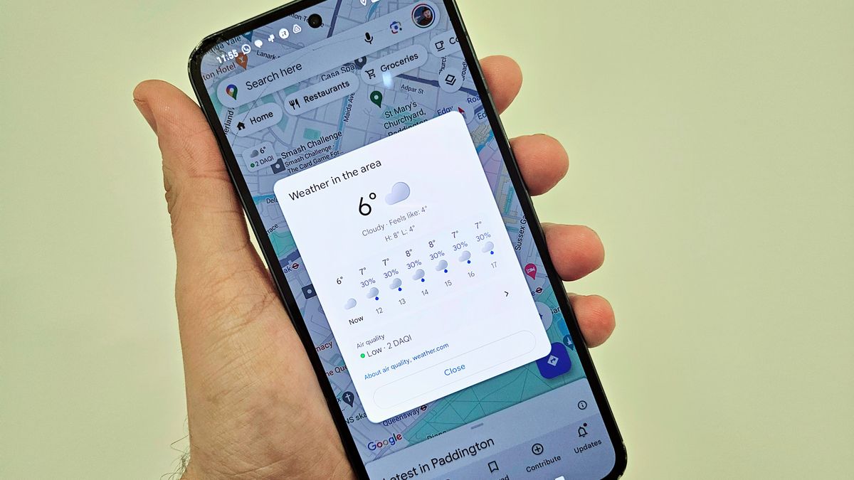
Google Maps for Android now includes weather information and an air quality overlay to help you plan your journeys and avoid pollution.
In Google Maps at the top left of the screen under the search bar and location filters, a tiny box has been added that provides the local weather forecast, temperature, and the daily air quality index. The box can be expanded to give more detailed weather information and hourly temperature forecasts for the next 12 hours. This information will also update if you change location, allowing you to check the local weather in other areas, thereby helping you plan a trip or just check the weather in other parts of the world.
Underneath this is the air quality rating which can be expanded to show a colour overlay over the map going from green to yellow, orange, red the purple along with a numerical rating from 1 – 10 to indicate air quality.
According to 9to5Google, the addition of weather information was added to version 11.113.XX of the Android app which requires Android 6 and up. However, iOS users will already be familiar with the weather information included in Google Maps as this feature has been a staple on the iOS version for years.
In practices this works rather well. For example, according to today’s air quality data seen in Google Maps, most of the UK appears as a green or 2 on the scale, indicating low air pollution. However, once zoomed out to Europe and beyond you begin to see higher ratings indicating a heavy level of air pollution. Milan and Venice seemed to show some of the highest levels of yellows (4), reds (8), and even the highest level of purple (10), so you might want to steer clear of these areas especially if you have any breathing issues.
Once in the air quality overview, you can expand the “About air quality info” section to be taken to a Google Maps help page explaining what the air quality scales are and how they are calculated, as well as information about the most common types of pollutants and where they come from as well as further info.
The air quality map isn’t worldwide, but it does currently include most of Europe. North America, Canada, Japan, South Korea, Cyprus, and Israel.
While this information is available from other sources if you search for it, the added convenience of being added to maps is much more convenient and could help you plan your journeys a little better from now on.


