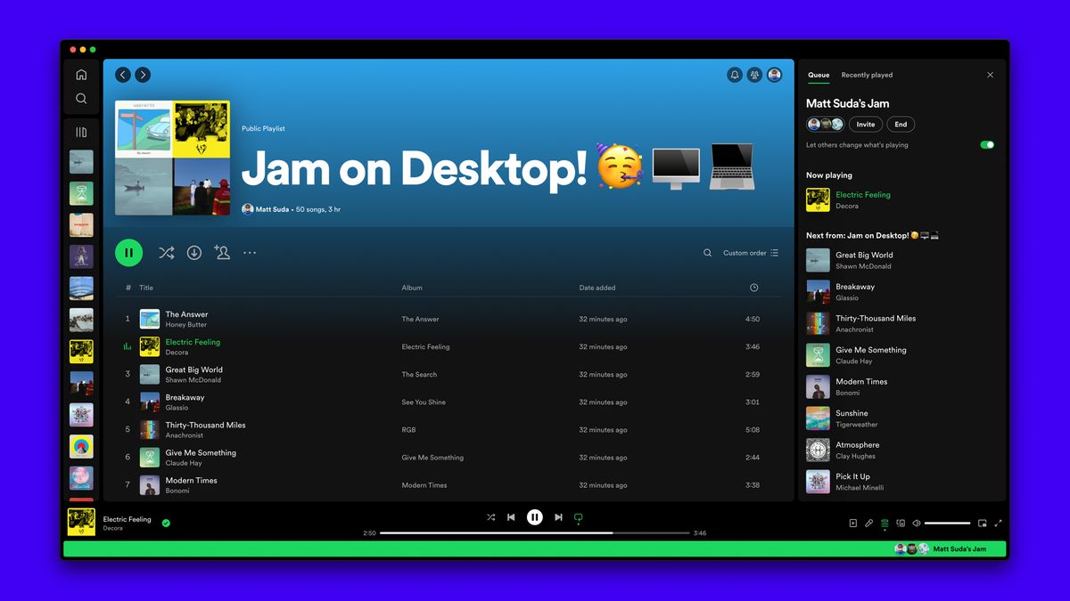
Spotify recently released the new “Jam” feature for its Windows 11 and 10 app, which allows users to listen to the same playlist or album at the same time on different devices. So you and a friend or coworker can enjoy the same tunes while you work, study, or just jam out (hence the name). However, with this new feature, the queue list has been booted to a small space on the right side of the app’s UI.
Please, please change it back. This is the opposite of an improvement.
foryoublue94 via Spotify Forum
This change has proven to be rather unfavorable among Spotify users, who’ve taken to Reddit to voice their complaints. The official blog post that announces the arrival of Jam dubs this change as the “new Queue experience”, explaining that the right sidebar now allows you to browse content in the app and keep an eye on what’s currently playing.
The official post has several disgruntled comments from users dismayed by the change, with one user saying “Why on earth has Queue and Recently Played been moved and is now cramped into the small right-hand column? This is just horrible, and a pain to look at. It makes zero sense from a usability standpoint.
Thanks, I hate it
You may be thinking something along the lines of what an odd little change for people to be riled up about! Pre-update, you could have your library on the left, your queue in the center, and your Now Playing view on the right. In other words, you could boot up the app and have everything you need all in one place. Now, you can only have one or two of these views open at once because of the new layout.
If you’re someone who’s a fan of the Jam feature and plans to use it quite often with your mates, you’re probably not as upset as other users. But, as a person who will probably never use the Jam feature, I feel robbed of a pretty decent app layout with nothing in return. Now, I am no longer able to see how long the current song is or the album name in the queue.
It seems like Spotify users live in fear of every new update that is implemented. A common notion that’s shared on Spotify Reddit and in the blog post comments is ‘another Spotify update, another change no one asked for.’ I use Spotify every day, and I can’t remember a single update implemented to the app on mobile and desktop that didn’t make me mad. Hopefully, we can convince Spotify to change everything back to how it was – or we’ll just end up waiting until another update comes around and knocks everything out of place again.


